2025 is shaping up to be an exciting year for home interiors, especially when it comes to living room paint colors. Whether you're into soft, calming tones or bold, dramatic shades, there's something for everyone. A fresh coat of paint can completely change the vibe of your living space, making it feel more inviting and reflective of your personality. Ready to find your perfect shade? Let’s dive into the top picks for the year.
Key Takeaways
- Cloudy Blue offers a calming, serene vibe for a peaceful living room.
- Delicate Pink brings warmth and soft elegance to your space.
- Ochre adds a touch of earthiness and pairs well with natural decor.
- Sage Green connects your living room to nature with its soothing tone.
- Terracotta creates a warm and cozy atmosphere, perfect for relaxing.
1. Cloudy Blue

Cloudy blue is like a breath of fresh air for your living room. It’s soft, understated, and incredibly versatile, making it perfect for creating a calm and inviting space. Whether your style leans modern or classic, this shade adapts beautifully.
Why Choose Cloudy Blue?
- Tranquility: This color has a soothing effect, ideal for relaxing after a long day.
- Versatility: Pairs well with neutral tones, warm woods, and even pops of metallic accents.
- Illusion of Space: Light blue hues can make smaller rooms feel larger and more open.
Tips for Using Cloudy Blue
- Paint all four walls for a cohesive look, or use it on an accent wall to add depth.
- Combine with white or off-white trim to keep the look crisp and clean.
- Layer in textures like soft throws and rugs to make the space feel cozy.
Cloudy blue isn’t just a color—it’s a mood. It invites you to slow down and enjoy the moment, making it a top choice for living rooms in 2025.
2. Delicate Pink
Delicate Pink is a timeless choice for living rooms, offering a soft and inviting atmosphere. Its understated elegance makes it versatile for various styles, from modern minimalism to classic charm.
Why Choose Delicate Pink?
- Creates a soothing and tranquil ambiance.
- Complements both bold and neutral decor.
- Reflects natural light beautifully, making spaces feel larger and brighter.
Styling Tips for Delicate Pink Walls
- Pair with white or cream furniture for a clean and airy look.
- Add metallic accents, like gold or rose gold, for a touch of glamour.
- Incorporate natural elements, such as wooden furniture or greenery, to balance the softness.
A living room painted in Delicate Pink can feel like a warm embrace, perfect for unwinding after a long day. Its gentle hue harmonizes with a variety of textures and tones, making it a favorite among designers.
3. Ochre
Ochre is that perfect in-between shade—neither too bright nor too muted. This golden-yellow hue, with its earthy brown undertones, exudes warmth and coziness, making it a fantastic choice for living rooms. It’s bold enough to make a statement but soft enough to feel inviting.
Why Choose Ochre for Your Living Room?
- Versatile Pairing: Ochre pairs beautifully with neutral tones like beige or taupe, as well as bolder accents like navy or emerald green.
- Mood Enhancer: The color radiates positivity and warmth, creating a welcoming atmosphere for both family and guests.
- Timeless Appeal: Unlike trendier shades, ochre has a classic vibe that doesn’t easily go out of style.
Tips for Using Ochre in Your Living Room
- Accent Wall: Paint a single wall in ochre to create a focal point without overwhelming the space.
- Layered Textures: Combine ochre walls with plush fabrics like velvet or linen for a layered, cozy feel.
- Complementary Decor: Use ochre in soft furnishings—think throw pillows, rugs, or curtains—to tie the room together.
Ochre is more than just a color; it’s a mood-setter. It invites you to sit back, relax, and enjoy the golden glow of a thoughtfully designed space.
4. Sage Green

Sage green is one of those colors that just feels timeless and fresh all at once. It’s soft, muted, and incredibly versatile, making it a top pick for living rooms in 2025. This shade brings a subtle connection to nature, creating a calm and inviting space. Whether you’re going for modern, rustic, or traditional vibes, sage green works beautifully.
Why Choose Sage Green?
- Neutral yet impactful: It’s easy on the eyes and pairs well with other colors, from warm beiges to crisp whites.
- Mood-enhancing: Green tones have a calming effect, perfect for a room where you unwind.
- Timeless appeal: Unlike trendier colors, sage green has staying power.
Styling Tips for Sage Green
- Pair with warm wood furniture to enhance its earthy feel.
- Add brass or gold accents for a touch of elegance.
- Use textured fabrics like linen or bouclé to keep the look cozy.
A sage green living room feels like a breath of fresh air—peaceful, balanced, and effortlessly stylish.
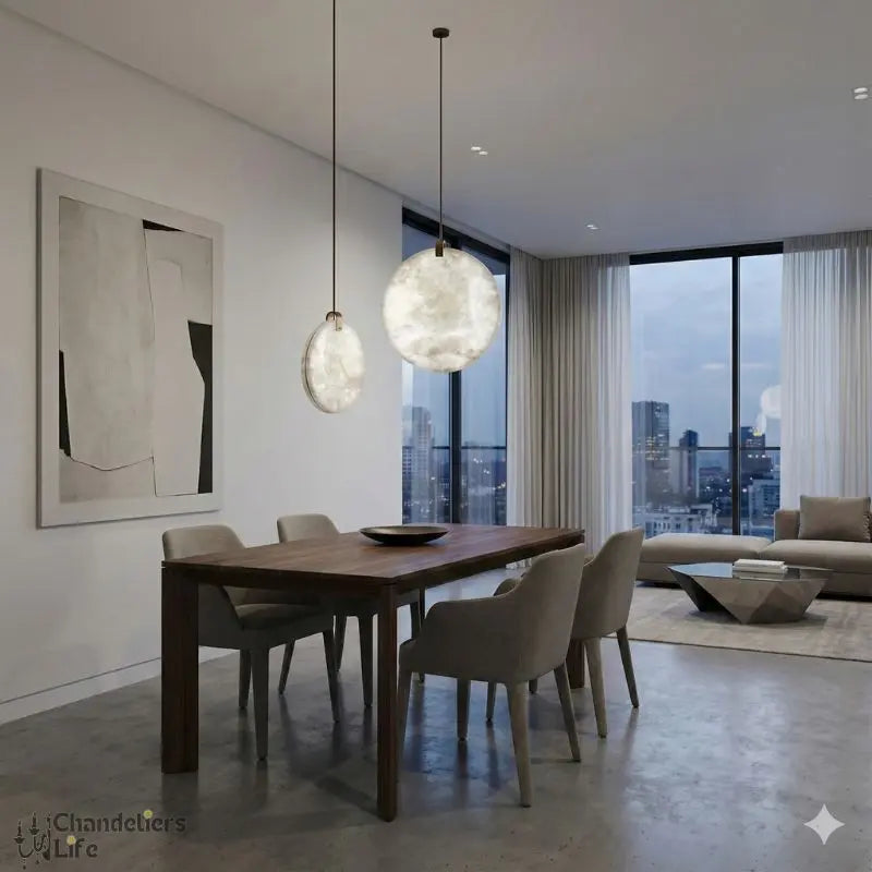
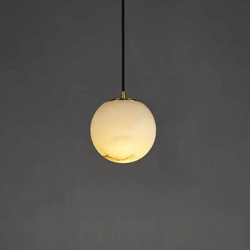
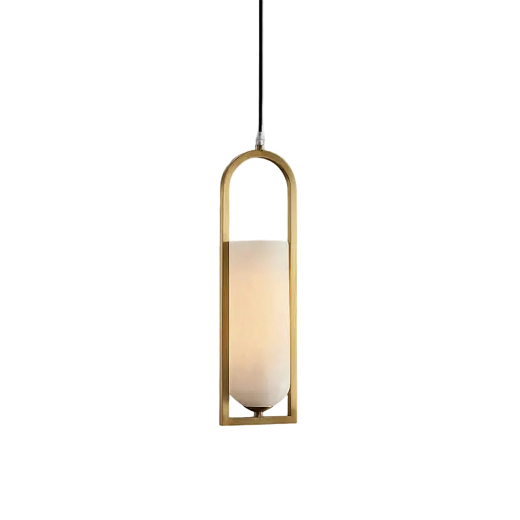
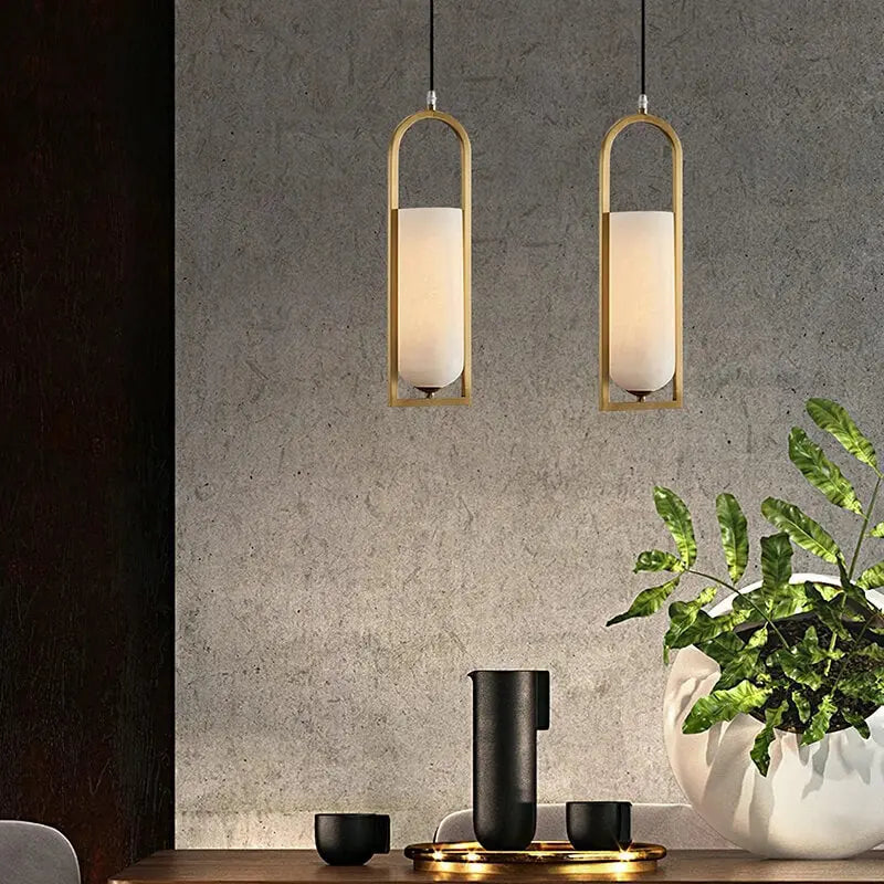
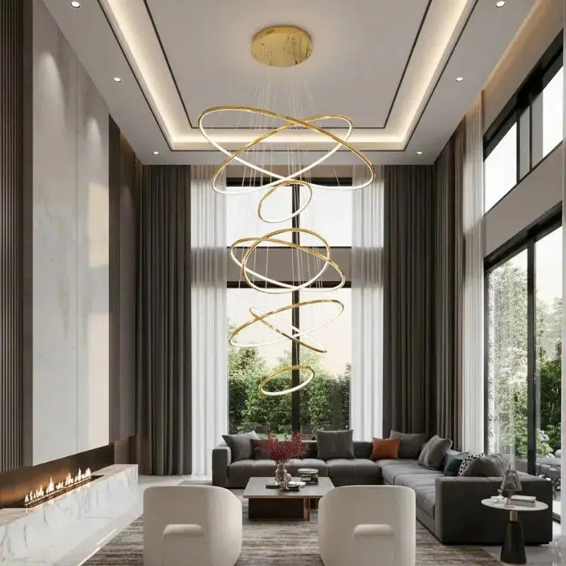
For lighting that complements sage green walls, consider exploring elegant lighting solutions featuring warm metals like gold or brass. These finishes harmonize beautifully with the soft green tones, enhancing the overall ambiance of your space.
5. Clay
Clay is one of those colors that immediately brings warmth and grounding to any space. Its earthy undertones make it versatile yet bold enough to stand out. This shade is perfect for creating a cozy and inviting living room, especially if you're aiming for a natural, organic vibe.
Why Choose Clay?
- Timeless Appeal: Clay hues have a classic quality that doesn’t go out of style.
- Pairs Beautifully: Works well with other earthy tones like beige, taupe, or even muted greens.
- Mood Enhancing: This color can make a space feel both calming and energizing, depending on the light.
Styling Tips for Clay Walls
- Contrast with Neutrals: Add white or off-white furniture to keep the room feeling light and airy.
- Natural Textures: Incorporate materials like wood, jute, or linen to enhance the earthy theme.
- Accent with Metallics: Copper or brass accents bring out the richness of clay tones.
Think of clay as the backdrop for creating a space that feels like a warm embrace. It's understated yet impactful, providing the perfect balance of comfort and style.
6. Terracotta
Terracotta is making a bold comeback in 2025, bringing warmth and a touch of earthy sophistication to living rooms. This deep, clay-inspired hue evokes a sense of comfort and nostalgia, while still feeling fresh and modern. Its versatility makes it a standout choice for both traditional and contemporary spaces.
Why Choose Terracotta?
- Timeless Appeal: This color has roots in Mediterranean and rustic design, adding a sense of history and character to your space.
- Warmth and Depth: Unlike brighter oranges, terracotta leans toward muted, earthy tones that feel welcoming and grounded.
- Pairs Beautifully: Works well with neutral palettes, natural wood, and even bold accents like navy or emerald green.
Styling Tips for Terracotta
- Accent Walls: Use terracotta on a single wall to create a focal point without overwhelming the room.
- Layer Textures: Pair it with soft textiles like wool or linen to enhance its cozy vibe.
- Mix Materials: Combine with terracotta-colored ceramics, leather furniture, or woven baskets for a cohesive look.
Terracotta is more than just a color—it's a mood. It brings the outdoors in, grounding your living room in a natural, earthy ambiance. Perfect for those seeking a cozy yet stylish retreat.
7. Sandstone Beige
Sandstone Beige is the ultimate neutral for 2025, blending warmth and sophistication seamlessly. This shade strikes the perfect balance between subtlety and character, making it a top choice for living rooms. Whether your style leans modern or traditional, this color adapts beautifully to any decor.
Why Choose Sandstone Beige?
- Versatility: It pairs well with almost any color palette, from earthy tones to bold accent hues.
- Timeless Appeal: Neutral shades like Sandstone Beige never go out of style, ensuring your space feels fresh for years.
- Cozy Atmosphere: The warm undertones create an inviting and comfortable environment.
Styling Tips:
- Combine with textured fabrics like linen or bouclé for added depth.
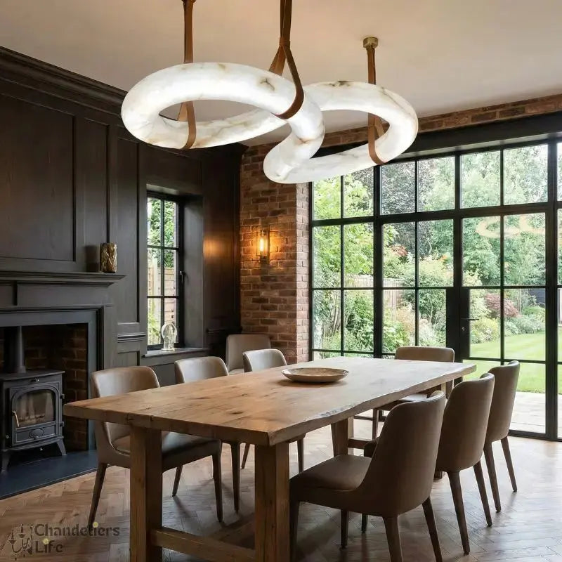
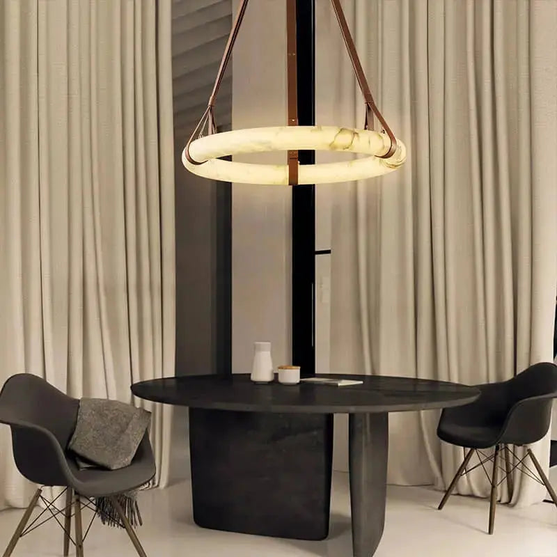
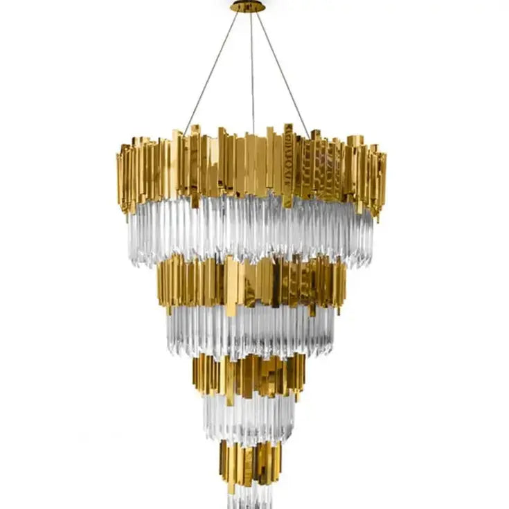
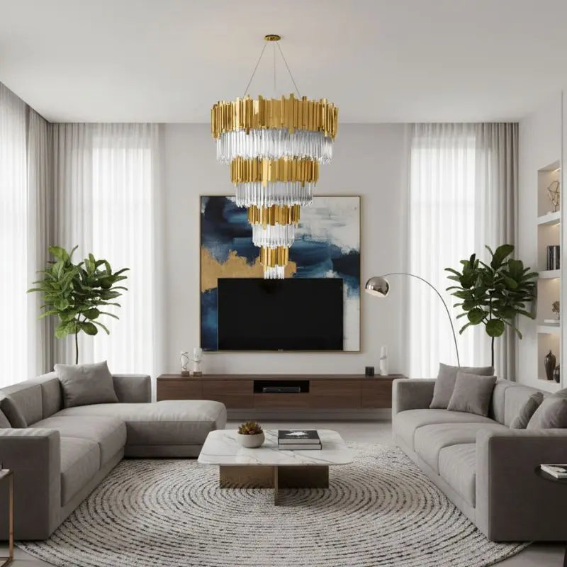
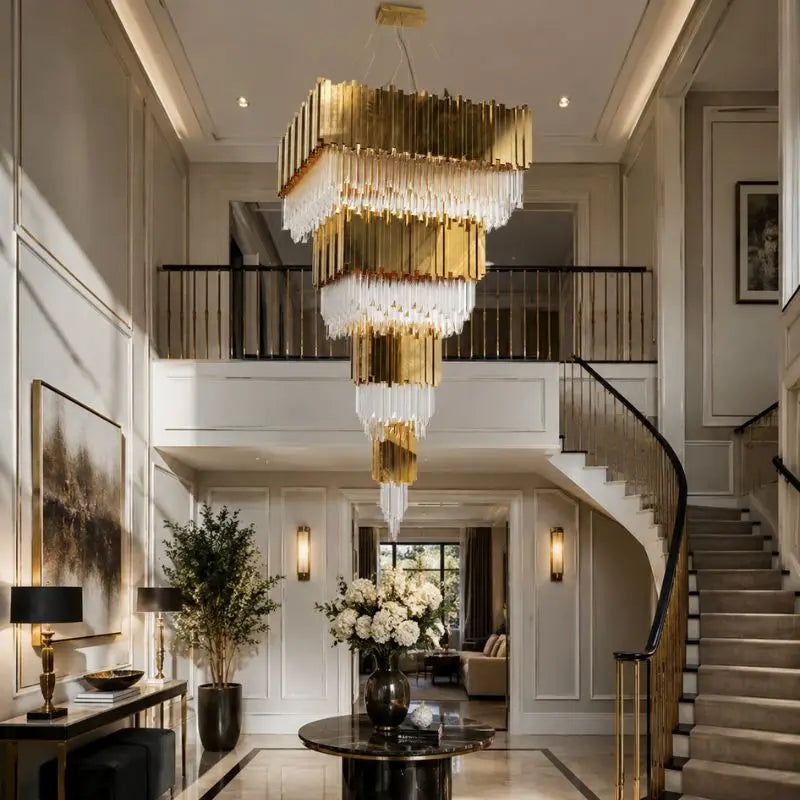
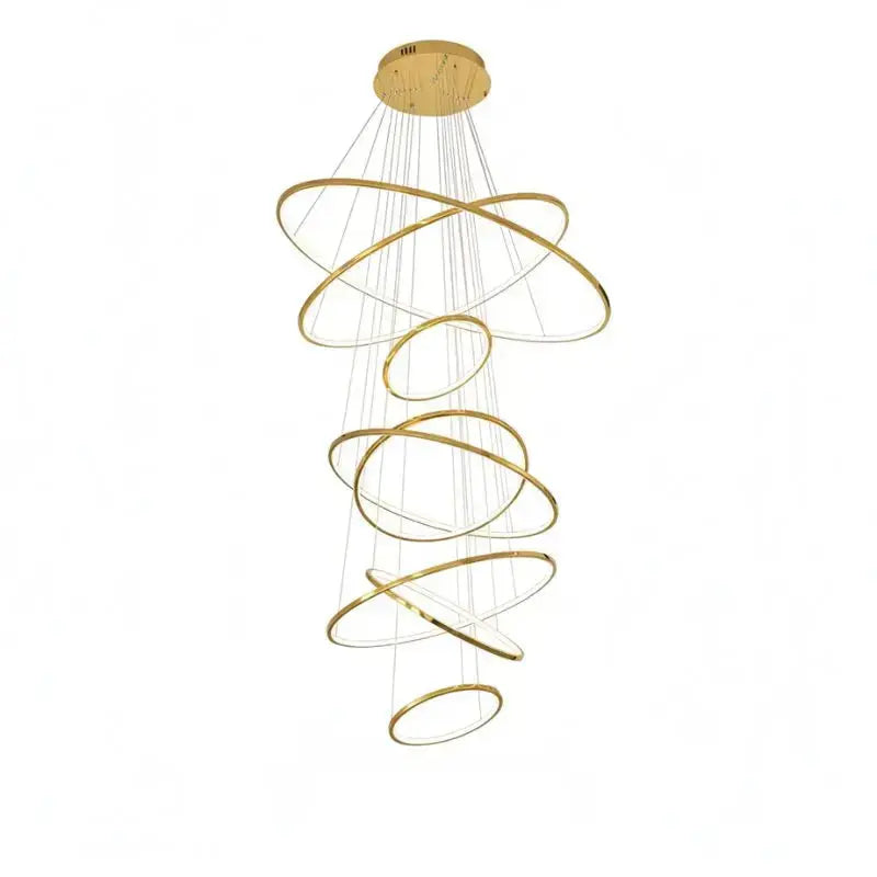
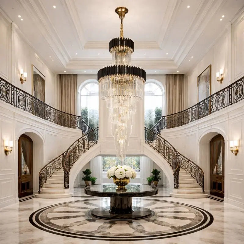
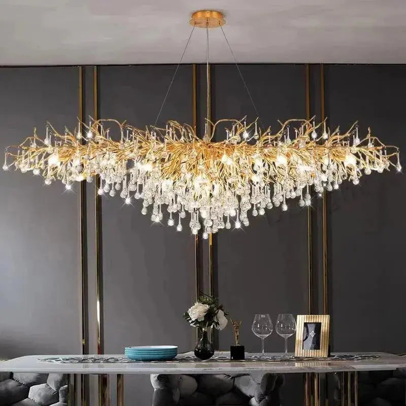
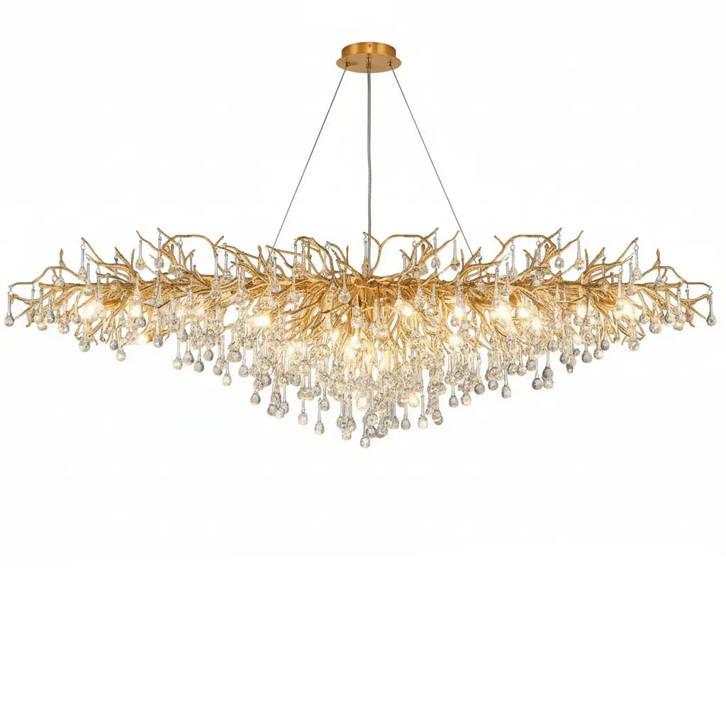
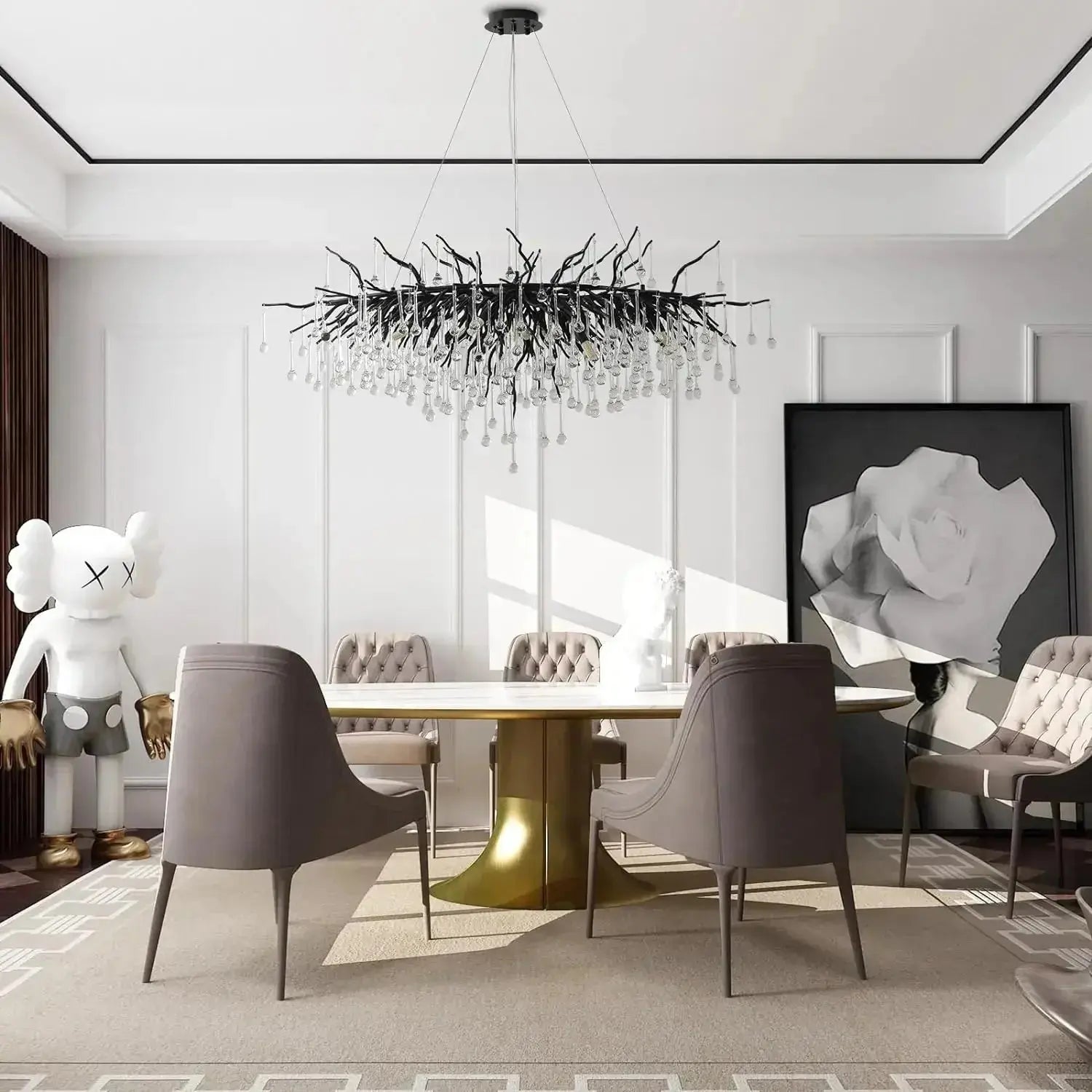
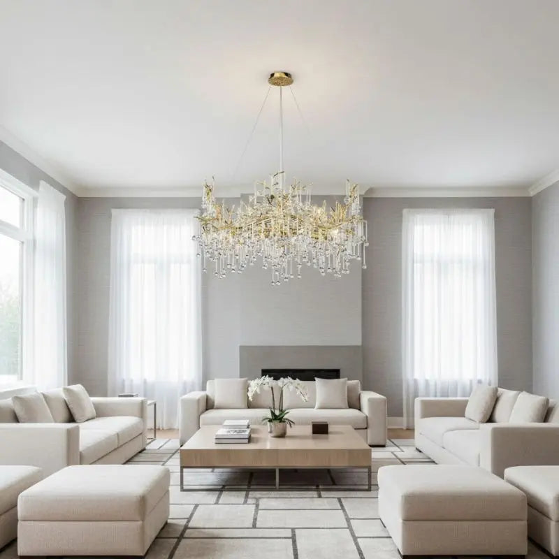
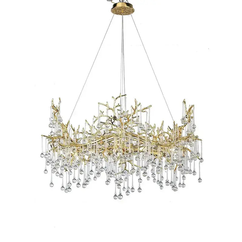
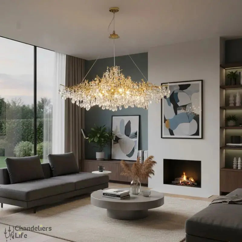
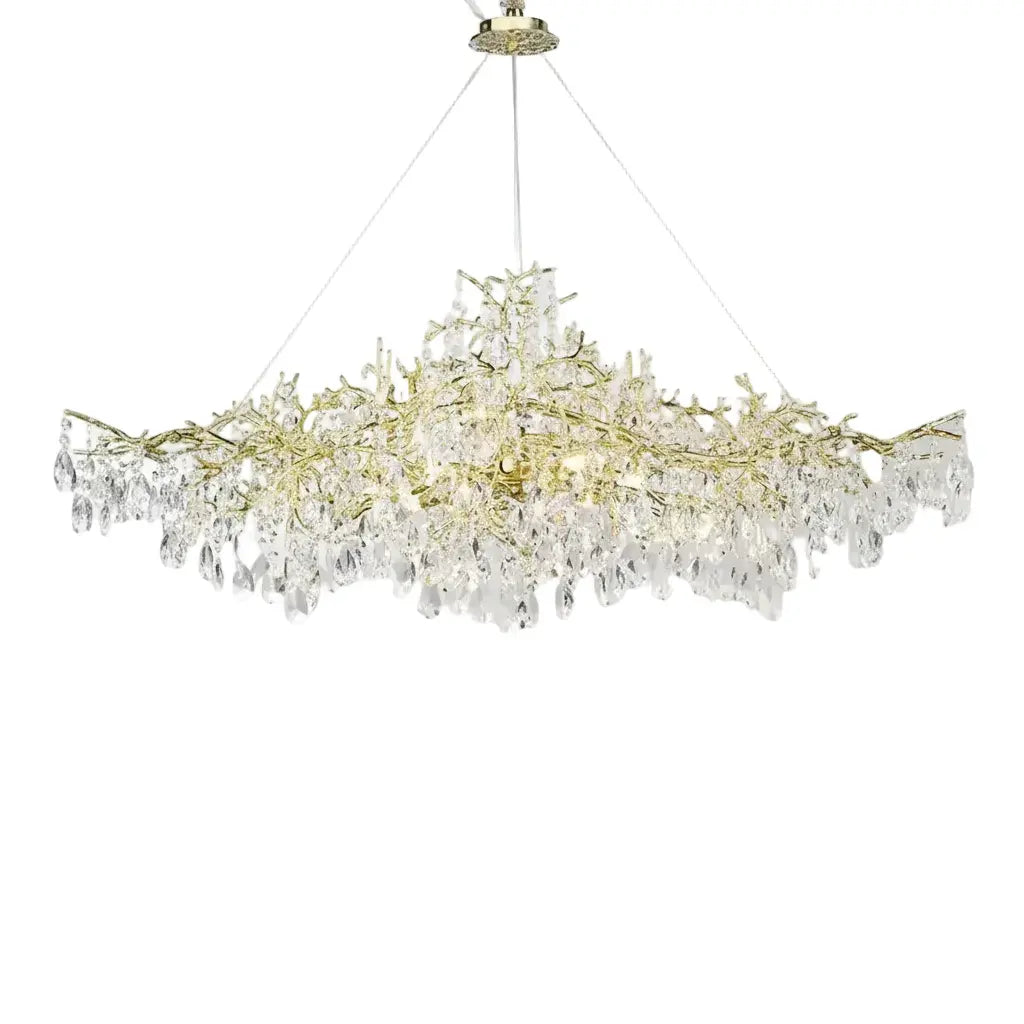
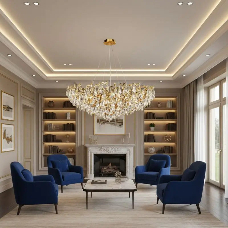
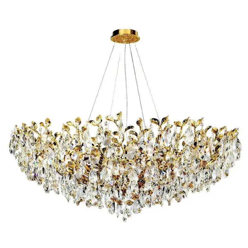
- Pair with exquisite chandeliers to elevate the elegance of your space.
- Add pops of color through cushions, throws, or artwork to bring the room to life.
Sandstone Beige is more than just a paint color; it’s a canvas for your creativity. Its understated charm allows your decor to shine while setting a serene and welcoming tone.
8. Blush Pink
Blush Pink is the epitome of subtle elegance, perfect for creating a serene and welcoming living room. This soft, muted shade brings a touch of warmth without overwhelming the space, making it ideal for both modern and traditional interiors. Its versatility allows it to pair beautifully with a range of other colors, from neutrals to bold accents.
- Why Choose Blush Pink?
- Styling Tips:
Blush Pink isn’t just a color; it’s a mood. It whispers tranquility and elegance, making your living room a haven of peace.
9. Soft Lavender
Soft lavender is a color that whispers elegance and serenity. This delicate shade of purple has a way of making a living room feel both airy and grounded. It’s perfect for anyone who wants a calming yet stylish atmosphere.
Why Choose Soft Lavender?
- Versatility: Pairs beautifully with neutrals like off-whites and taupes, but can also pop against darker tones like charcoal gray.
- Mood Enhancer: Known for its calming properties, it creates a tranquil vibe that’s ideal for relaxing or entertaining.
- Timeless Appeal: While trendy, it doesn’t feel faddish—it’s a color that can grow with your style.
Styling Tips for Soft Lavender Walls
- Layer Textures: Add plush throws, velvet cushions, or a soft rug in complementary shades to enhance the cozy factor.
- Accent with Metallics: Silver or rose gold accents can elevate the look, giving the room a touch of sophistication.
- Incorporate Natural Materials: Wooden furniture or woven baskets balance the coolness of lavender, making the space feel grounded.
A room painted in soft lavender feels like a gentle embrace—subtle yet impactful, making it a top choice for 2025.
For those looking to experiment, consider creative accent wall ideas to break up the monotony and add depth to your living space. Soft lavender works wonderfully as an accent color, especially when paired with textured or patterned walls.
10. Mint Green
Mint green is like a breath of fresh air for your living room. Its soft, cool tone instantly creates a sense of calm and openness. This shade is perfect for those who want a subtle pop of color without overwhelming the space. It’s versatile enough to pair with neutrals, pastels, or even bold accents.
Why Choose Mint Green?
- Refreshing and Inviting: Mint green brings in a light, airy vibe, making it ideal for smaller spaces or rooms that need brightening up.
- Versatile Pairings: It works beautifully with natural wood tones, whites, and even metallic accents like gold or silver.
- Timeless Appeal: Unlike trendier colors, mint green has a classic charm that doesn’t go out of style.
Styling Tips
- Accent Walls: Use mint green on a single wall to create a focal point without overdoing it.
- Furniture and Decor: Incorporate mint green through cushions, throws, or even a painted coffee table.
- Layer with Textures: Combine it with soft fabrics like linen or velvet for a cozy yet elegant look.
Mint green is a fantastic choice for those looking to transform their living room with creative accent wall ideas. Its soothing tone makes any space feel more inviting and stylish.
11. Charcoal Grey
Charcoal grey is one of those colors that’s both bold and versatile. It adds a dramatic touch to your living room without feeling overpowering. This shade works beautifully as a backdrop for bright, colorful accents or metallic finishes. Whether your style leans modern, industrial, or even rustic, charcoal grey can adapt to your vision.
Why Choose Charcoal Grey?
- Timeless Appeal: It’s a color that never goes out of style, making it a safe yet striking choice.
- Versatility: Works well with a variety of color palettes, from warm neutrals to vibrant jewel tones.
- Mood Setter: Creates a cozy, intimate atmosphere, perfect for relaxing or entertaining.
Design Tips for Charcoal Grey Walls
- Pair it with light-colored furniture, like cream or white sofas, to balance the depth of the color.
- Use pendant lighting with metallic finishes to add a touch of glamour.
- Incorporate natural textures like wooden tables or woven rugs to soften the overall look.
Charcoal grey is more than just a neutral; it’s a statement. It provides the perfect canvas for showcasing your unique style while maintaining a sense of sophistication.
12. Emerald Green
Emerald Green is a showstopper that balances boldness and elegance, making it a top choice for 2025 living rooms. This rich, jewel-toned green brings a sense of luxury while staying grounded in nature. Its versatility allows it to shine in various styles, from modern to traditional.
Why Choose Emerald Green?
- It pairs beautifully with metallic accents like gold or brass, adding a touch of glamour.
- Works well with neutral furnishings, creating a balanced and sophisticated look.
- Can be used as a feature wall or throughout the room for a dramatic effect.
Tips for Using Emerald Green
- Complement it with warm wood tones for a cozy atmosphere.
- Use velvet or other textured fabrics in similar shades for added depth.
- Incorporate natural light to enhance its vibrancy.
Emerald Green is more than just a color; it’s a statement of elegance and boldness. Perfect for those looking to create a space that feels both luxurious and inviting.
For a modern minimalist living room, consider pairing Emerald Green walls with a sofa with clean lines to keep the space sleek and uncluttered. This combination ensures a stylish yet functional design.
13. Navy Blue
Navy blue is a timeless color that brings depth and elegance to any living room. Its versatility works well with various styles, from classic to modern. This shade is perfect for creating a cozy yet sophisticated atmosphere. Whether you want to highlight a single wall or paint the entire room, navy blue can make a striking impact.
Why Choose Navy Blue?
- Rich and Timeless: Navy blue never goes out of style, making it a safe yet bold choice.
- Pairs Well with Metallics: It looks stunning when paired with brass or gold accents.
- Adaptable: Works beautifully with light neutrals or vibrant colors for contrast.
Popular Navy Blue Shades
| Paint Name | Description |
|---|---|
| Naval SW 6244 | A classic navy, perfect with brass accents. |
| Slate Tile SW 7624 | A cool gray-blue that adds sophistication. |
| Hague Blue | A lush, deep blue ideal for historic homes. |
Pro Tips for Decorating with Navy Blue
- Lighting Matters: Use warm lighting to balance the deep color.
- Accent with Textures: Velvet cushions or a patterned rug can add depth and interest.
- Mix and Match: Combine navy walls with light furniture to avoid making the room feel too dark.
Navy blue is more than just a color choice; it’s a statement. It gives your living room a sense of calm and luxury, making it a space you’ll love to spend time in.
14. Deep Orange
Deep orange is a bold and captivating choice for a living room, offering a sense of warmth and energy that few other colors can match. Its vibrant yet earthy tone can instantly make a space feel alive and welcoming. Whether you’re aiming for a modern, eclectic vibe or a cozy, rustic retreat, this hue has the versatility to adapt.
Why Choose Deep Orange?
- Warmth and Energy: Deep orange brings a lively and inviting atmosphere, perfect for spaces where people gather.
- Versatility: Pairs beautifully with complementary colors like navy blue, charcoal gray, or even soft beige.
- Statement-Making: Ideal for accent walls or as a backdrop for bold artwork and furniture.
Styling Tips for Deep Orange
- Balance with Neutrals: Use neutral tones like white or cream to tone down the intensity and create a harmonious look.
- Incorporate Textures: Add depth by combining deep orange walls with textured fabrics like velvet or linen.
- Accent with Metallics: Gold or bronze accents can elevate the richness of the color.
Deep orange is more than just a paint color—it’s a mood. It radiates warmth, creativity, and a touch of daring, perfect for making your living room unforgettable.
For more ideas on how to blend bold hues with your decor, explore living room color schemes that can transform your space.
15. Emerald Green
Emerald Green is the ultimate choice for creating a bold yet inviting living room in 2025. This deep, vibrant hue brings a sense of elegance and richness to any space. Whether you’re aiming for a modern or traditional look, emerald green adapts beautifully to various styles.
Why Choose Emerald Green?
- Versatility: Pairs well with neutrals like beige or gray, as well as metallic accents like gold and brass.
- Mood Enhancer: Evokes feelings of tranquility while adding a touch of luxury.
- Nature-Inspired: Connects your living room to the outdoors, creating a refreshing atmosphere.
Tips for Using Emerald Green
- Accent Walls: Highlight one wall in emerald green for a dramatic focal point.
- Furniture and Decor: Incorporate emerald green through sofas, cushions, or curtains for subtle elegance.
- Layer with Textures: Combine with velvet or silk fabrics to enhance its luxurious appeal.
Emerald Green is not just a color; it’s a statement. It transforms your living room into a sophisticated haven while staying grounded in nature.
16. Warm Beige
Warm beige is the perfect blend of subtlety and sophistication, making it a timeless choice for living rooms. This versatile shade creates a cozy, inviting atmosphere while maintaining a modern edge. Whether your style leans minimalist or eclectic, warm beige acts as the ultimate neutral backdrop, allowing your furniture and decor to shine.
Why Choose Warm Beige?
- Timeless Appeal: It never goes out of style and works with both traditional and contemporary designs.
- Versatility: Pairs beautifully with almost any color palette, from bold jewel tones to soft pastels.
- Cozy Ambiance: Adds warmth to your space without overwhelming it.
Styling Tips for Warm Beige Walls
- Layer Textures: Add depth with a mix of materials like a plush beige sofa, wooden side tables, and metallic accents.
- Accent Colors: Incorporate pops of color with cushions, rugs, or artwork in shades like sage green, navy blue, or blush pink.
- Lighting Matters: Opt for warm lighting to enhance the cozy feel of the beige tones.
Warm beige is more than just a color; it's a foundation for creating a space that feels like home.
17. Soft Taupe
Soft taupe is the unsung hero of neutral tones. It’s not as stark as white, nor as bold as darker browns, but it strikes the perfect balance between warmth and sophistication. This shade offers a versatile backdrop that complements almost any decor style. Whether your living room leans modern, traditional, or somewhere in between, soft taupe can tie it all together seamlessly.
Why Choose Soft Taupe?
- Timeless Appeal: Unlike trendier colors, taupe has a classic quality that ages gracefully.
- Versatility: It pairs beautifully with both cool and warm hues, making it easy to mix and match.
- Cozy Atmosphere: Soft taupe lends a sense of calm and comfort to any space.
Tips for Decorating with Soft Taupe
- Pair it with natural textures like wood or rattan for an earthy, grounded look.
- Use accent colors like deep greens or burnt oranges to add depth and character.
- Incorporate metallics—think gold or bronze—for a touch of elegance.
Soft taupe is the kind of color that whispers rather than shouts, making it a perfect choice for creating a serene and inviting living room.
18. Warm Greys
Warm greys are the unsung heroes of interior design. They’re subtle, sophisticated, and work in almost any setting. These shades bring a cozy yet modern vibe to a living room, making them perfect for 2025's decor trends.
Why Choose Warm Greys?
- They are incredibly versatile and pair well with both bold and neutral accents.
- Warm greys create a calming environment without feeling too stark or cold.
- They can make small spaces feel larger and more inviting.
Tips for Using Warm Greys in Your Living Room:
- Combine warm grey walls with natural wood furniture to emphasize earthy tones.
- Add pops of color like mustard yellow or soft pink to liven up the space.
- Use textured elements like a boucle sofa or a wool rug for added depth.
When painted in warm grey, a room feels timeless yet fresh. It’s a shade that adapts beautifully to changing styles and seasons.
For smaller spaces, consider lighter warm greys like Sherwin-Williams’ ‘Agreeable Gray’ or Benjamin Moore’s ‘Revere Pewter.’ These shades reflect light and make the room feel airy. For a bolder look, deeper tones like ‘Gauntlet Gray’ can add drama and sophistication.
Structured use of warm greys can transform your living room into a stylish retreat. If you’re looking for expert advice on choosing the right shade for a small space, check out Expert tips for choosing paint colors in small spaces.
19. Off-Whites
Off-whites are the unsung heroes of interior design. They’re subtle, versatile, and can completely change the vibe of a room without making a bold statement. In 2025, off-whites are all about creating spaces that feel light, open, and timeless.
Why Choose Off-Whites?
- They pair beautifully with almost any accent color or decor style.
- Off-whites make small rooms feel larger and brighter.
- These shades are perfect for creating a calm, neutral backdrop.
Popular Off-White Shades in 2025
Here are some of the most-loved off-white tones making waves this year:
| Shade Name | Description |
|---|---|
| Pure White SW 7005 | Crisp and clean, great for walls or trim. |
| Alabaster SW 7008 | Soft and warm, ideal for cozy spaces. |
| Shoji White SW 7042 | Subtle gray undertones for a modern vibe. |
| Eider White SW 7014 | Cool-toned white, perfect for sleek designs. |
| Dover White SW 6385 | Creamy with a hint of yellow for warmth. |
Tips for Using Off-Whites
- Test the color in different lighting to see how it shifts throughout the day.
- Pair off-whites with natural textures like wood or stone for added warmth.
- Use them as a base and layer with bold or pastel accents for depth.
Off-whites are more than just "safe" choices—they’re the foundation for creating spaces that feel effortlessly elegant and endlessly adaptable.
20. Beige
Beige is often seen as a safe, neutral choice, but it can be so much more than that. This timeless color offers incredible versatility, making it a favorite for living rooms in 2025. Whether you pair it with bold accents or keep it subtle, beige creates a warm and inviting atmosphere.
Here’s why beige is a standout choice for your living room:
- Adaptable to Any Style: Beige works beautifully with modern, traditional, and even eclectic designs. It’s like a blank canvas that lets your furniture and decor shine.
- Pairs Well with Other Colors: Whether you’re into jewel tones, pastels, or earthy shades, beige provides the perfect backdrop.
- Brightens a Room: Light beige tones reflect natural light, making your space feel larger and more open. Light colors like beige are perfect for creating an airy vibe.
Beige doesn’t have to be boring. Play around with textures—think a beige bouclé sofa, woven rugs, or even beige accent walls with a subtle pattern. It’s all about layering to add depth and interest.
21. Taupe
Taupe is one of those colors that feels timeless and versatile, making it a favorite for living room makeovers. Its subtle warmth and neutral base create a cozy yet sophisticated atmosphere. Whether your style leans modern, rustic, or classic, taupe can adapt beautifully.
Why Choose Taupe?
- Neutral Elegance: Taupe blends the best of gray and beige, offering a balanced backdrop for any decor.
- Pairs Well with Accents: It works seamlessly with bold colors like navy or emerald, as well as softer tones like blush or cream.
- Mood Enhancer: The color is calming and inviting, perfect for spaces meant to relax and entertain.
Tips for Using Taupe in Your Living Room
- Layer with Textures: Pair taupe walls with plush fabrics like velvet or bouclé to add dimension.
- Accent with Metallics: Gold or bronze accents can elevate the look, adding a touch of luxury.
- Play with Lighting: Use warm lighting to enhance taupe’s cozy undertones.
Taupe is the unsung hero of interior design—versatile, chic, and endlessly adaptable. It’s a color that makes a statement without shouting.
22. Rich Blues
Rich blues are all the rage for 2025, and it’s easy to see why. These shades bring depth, elegance, and a touch of drama to any living room. Whether you’re after a bold statement or a serene retreat, blue’s versatility has you covered. It’s the color that never goes out of style.
Why Choose Rich Blues?
- Timeless Appeal: Blue hues, from navy to slate, have an enduring quality that pairs well with both modern and traditional decor.
- Mood Enhancer: Deep blues can create a calming atmosphere, while brighter tones energize a space.
- Versatility: Rich blues complement a wide range of colors, from warm neutrals to vibrant jewel tones.
Popular Shades for 2025
| Shade Name | Description |
|---|---|
| Naval SW 6244 | A classic navy, perfect with brass accents. |
| Slate Tile SW7624 | A cool gray-blue for a sophisticated vibe. |
| Briny SW 6775 | A saturated blue-green, inspired by the coast. |
| Aleutian SW 6241 | A soft blue with gray undertones, very tranquil. |
Styling Tips for Rich Blues
- Pair with Metallics: Gold or brass accents elevate the richness of blue tones.
- Layer Textures: Combine velvet cushions, woven rugs, and sleek furniture for depth.
- Accent Walls: Use a bold blue on one wall to anchor your living room without overwhelming the space.
Bold blues are more than just a trend—they’re a way to infuse personality and elegance into your home. Don’t be afraid to experiment with different shades and finishes to find your perfect match.
For more ideas on how to transform your space, explore creative living room lighting ideas to complement your rich blue walls.
23. Sunshine Yellow
Sunshine Yellow is like a burst of happiness for your living room walls. It’s bold, it’s bright, and it brings an undeniable warmth to your space. This color is perfect for those who want to make a statement while keeping things cheerful and inviting.
Why Choose Sunshine Yellow?
- Mood Booster: Yellow is known to evoke feelings of joy and positivity. Imagine starting your day in a room that feels like a ray of sunshine.
- Versatility: Pair Sunshine Yellow with white accents for a fresh, crisp look, or combine it with darker shades like charcoal gray for a modern twist.
- Light Enhancer: This shade reflects natural light beautifully, making smaller spaces feel larger and more open.
Styling Tips for Sunshine Yellow
- Accent Furniture: Incorporate yellow throw pillows or a bold yellow armchair to tie the room together without overwhelming it.
- Artwork: Opt for wall art that complements the yellow tones, such as pieces with hints of blue or green.
- Layer Textures: Add depth by mixing materials like wood, metal, and soft fabrics in neutral tones.
A room painted in Sunshine Yellow feels like a perpetual summer day—warm, inviting, and full of life. It’s a choice that dares to be different while remaining timeless.
24. Poppy Red
Poppy Red is the kind of color that demands attention and brings a burst of energy to your living room. This fiery, vibrant hue is perfect for those who want their space to feel bold and alive. Whether you're going for a modern vibe or something more eclectic, this shade works wonders in creating a statement.
Here are some ways to incorporate Poppy Red into your living room:
- Accent Walls: Paint one wall in Poppy Red to create a focal point without overwhelming the room.
- Furniture Choices: Consider a bold red sofa or armchair to add a pop of color without committing to painting the walls.
- Decorative Elements: Use red throw pillows, rugs, or artwork to tie the room together.
Poppy Red pairs beautifully with neutral tones like beige or gray, but it can also be matched with deep blues or greens for a striking contrast. Experiment with textures and finishes to find the perfect balance for your space.
25. Two-Tone Walls and Accent Walls and more
Two-tone walls and accent walls are like giving your living room a personality boost without going overboard. They’re an easy way to add depth and creativity to any space while keeping things stylish and modern. Here’s why they’re worth considering:
Popular Two-Tone Combinations
- White and Navy: A crisp, timeless look that feels both clean and bold.
- Beige and Terracotta: Warm and inviting, this combo screams cozy evenings.
- Gray and Mustard Yellow: Perfect for a trendy, modern vibe.
Benefits of Accent Walls
- Focal Point: Accent walls naturally draw attention to a specific area of the room, whether it’s a fireplace or a gallery wall.
- Style Upgrade: They let you experiment with bold colors or textures without committing to an entire room.
- Budget-Friendly: You get a dramatic change without the cost of a full renovation.
Tip: Transform your bathroom or any smaller space with an accent wall using bold paint, textured tiles, or even unique wallpaper. It’s a simple way to make a big impact.
Getting Started
- Choose Your Colors: Pick shades that complement your furniture and decor. Don’t forget to test them in different lighting.
- Decide on Placement: Will it be a single wall or a two-tone split across the room? Plan it out.
- Add Texture: Think about using wood panels, wallpaper, or textured paint for extra flair.
Two-tone walls and accent features are all about experimenting and having fun. Start small and see how it transforms your space!
Conclusion
Choosing the right paint color for your living room can feel like a big decision, but it’s also an exciting opportunity to refresh your space and make it your own. Whether you’re drawn to calming neutrals, bold statement shades, or earthy tones inspired by nature, there’s something for every style and mood in 2025’s top color trends. Take your time, test out a few samples, and think about how the colors will work with your furniture, lighting, and overall vibe. A fresh coat of paint can completely transform your living room, turning it into a space that feels cozy, stylish, and uniquely yours. So grab that brush and get started—you’ve got this!
Frequently Asked Questions
What are the top living room paint color trends for 2025?
For 2025, popular trends include earthy neutrals like beige and taupe, vibrant shades such as emerald green and deep orange, and nature-inspired tones like sage green and terracotta. Pastels like blush pink and mint green are also making a comeback.
How can I choose the right paint color for my living room?
Consider the size of your room, the lighting, and your existing furniture and decor. Light colors can make a small room feel bigger, while darker shades add coziness to larger spaces. Testing paint samples on your walls is a good way to see how colors look in your space.
Are neutral colors still trendy for living rooms in 2025?
Yes, neutral colors like warm greys, off-whites, and taupe remain popular because they are versatile and timeless. They pair well with colorful accents like cushions, rugs, or artwork to add personality to the space.
What are the benefits of using bold colors in a living room?
Bold colors like navy blue, emerald green, or terracotta can make a strong statement and add depth and character to your living room. They work well as accent walls or when paired with neutral furniture to create a balanced look.
What mistakes should I avoid when picking a paint color?
Avoid skipping paint samples, as colors can look different under various lighting conditions. Don’t use too many bold colors in one space, as this can make the room feel cluttered. Also, consider how the color complements your furniture and decor.
What are two-tone walls, and why are they popular?
Two-tone walls involve using two different colors on the same wall or in the same room. They add creativity and depth to a living space. Popular combinations include white and navy or beige and terracotta, which can make your living room more dynamic and stylish.