Choosing the right paint color for your living room can completely change how it feels. Whether you want something calm and soothing or bold and lively, the right color makes all the difference. With 2025 just around the corner, we’ve rounded up the top living room paint colors to inspire your next home makeover.
Key Takeaways
- Earthy greens like 'Sea Salt' bring a calming, natural vibe.
- Neutral shades such as 'Grounded' create a stable and versatile base.
- Jewel tones like 'Rumors' add boldness and sophistication.
- Soft pastels like 'Tissue Pink' offer a light and cheerful touch.
- Deep, rich colors like 'Gentleman’s Gray' make a dramatic statement.
1. Sea Salt
Sea Salt is a delicate shade that dances between soft green and subtle gray, with just a whisper of blue undertones. It's a versatile choice that works wonders in living rooms, especially if you're aiming for a serene, airy vibe. This color has a natural ability to make a space feel calm and effortlessly inviting.
Why Choose Sea Salt for Your Living Room?
- Versatility: Whether your decor leans coastal, modern, or rustic, Sea Salt adapts beautifully.
- Light Enhancer: Its soft tones reflect natural light, making rooms appear more spacious and bright.
- Mood Setter: The calming hues create a tranquil environment, perfect for unwinding after a long day.
Styling Tips
- Pair Sea Salt walls with white or cream furniture to keep the space light and open.
- Add natural elements like wooden coffee tables or woven rugs for a cozy, grounded feel.
- Use soft gray or muted blue accents to complement the color’s undertones.
If you're looking for a paint color that feels fresh yet timeless, Sea Salt might just be the perfect pick for your living room.
2. Grounded
"Grounded" is a soft brown that brings an earthy, calming vibe to any living room. It's one of those colors that feels like a warm hug, perfect for creating a cozy, welcoming space. If you're looking for a color that ties your room together without stealing the spotlight, "Grounded" is it.
Why Choose "Grounded"?
- It pairs beautifully with natural wood tones, enhancing a room's organic feel.
- Works well with both warm and cool accent colors, giving you flexibility in decor.
- Its understated elegance makes it ideal for open-concept living spaces.
Styling Tips:
- Use "Grounded" on all four walls to create a cocoon-like atmosphere, especially in larger rooms.
- Pair it with white trim or molding for a clean, classic contrast.
- Incorporate textures like woven rugs, linen curtains, or leather furniture to complement its earthy tone.
Pro Tip: Experiment with "double drenching" by pairing "Grounded" with a muted blue or green, like "Rain Cloud," for a layered, sophisticated look.
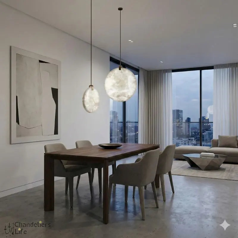
Looking to elevate your space even more? Consider adding a statement piece, like pendant lighting, to highlight the room's features. Check out the stylish lighting fixtures to find options that blend seamlessly with "Grounded."
3. Rumors
Rumors is a deep, moody red with subtle brown undertones that brings a sense of drama and sophistication to any living space. This color is perfect for creating a bold statement while maintaining a warm, inviting atmosphere. Whether you’re looking to transform an accent wall or redefine an entire room, Rumors offers versatility and character.
Where to Use Rumors:
- Accent Walls: Highlight your living room or dining area by painting a single wall in this rich shade, creating a focal point that draws the eye.
- Trim and Details: Use Rumors on window frames, baseboards, or crown molding for a unique, polished look that contrasts beautifully with lighter walls.
- Cozy Corners: Paint a reading nook or small study in Rumors to evoke a sense of luxury and intimacy.
For the best effect, pair Rumors with layered lighting to emphasize its depth and warmth. This shade works beautifully with neutral furniture and metallic accents, adding a touch of modern elegance to your decor.
4. Bosc Pear
Bosc Pear is a standout shade for 2025, blending the richness of cinnamon and gold to create a warm, inviting atmosphere. This color is perfect for those who want to bring a touch of sophistication and comfort into their living spaces.
Why Choose Bosc Pear?
- Adds a luxurious yet grounded feel to any room.
- Pairs beautifully with jewel tones like sapphire blue or burgundy for a bold look.
- Works equally well with neutral palettes for a more understated elegance.
Styling Tips
- Use Bosc Pear on an accent wall to draw attention without overpowering the room.
- Complement it with soft furnishings in muted tones, like cream or taupe.
- Incorporate metallic accents—think gold or brass—to enhance its opulent undertones.
Bosc Pear is more than just a color; it’s a statement of style and warmth that transforms your living room into a haven of elegance.
5. Tissue Pink
Tissue Pink is the shade that whispers elegance and warmth into your living space. This soft, blush-toned hue is perfect for creating a serene and welcoming ambiance in your living room. It’s a color that feels timeless yet fresh, fitting seamlessly into both modern and classic interiors.
Why Choose Tissue Pink?
- Versatility: Works beautifully with neutral palettes like gray or beige, but also pairs well with bold accents like navy or emerald green.
- Mood Enhancer: Its gentle tone promotes relaxation and a sense of calm, making it ideal for spaces where you unwind.
- Light Reflection: This shade enhances natural light, giving your room a soft, radiant glow.
Styling Tips for Tissue Pink
- Add texture with velvet throw pillows or a chunky knit blanket in complementary colors.
- Incorporate metallic accents like gold or rose gold for a touch of sophistication.
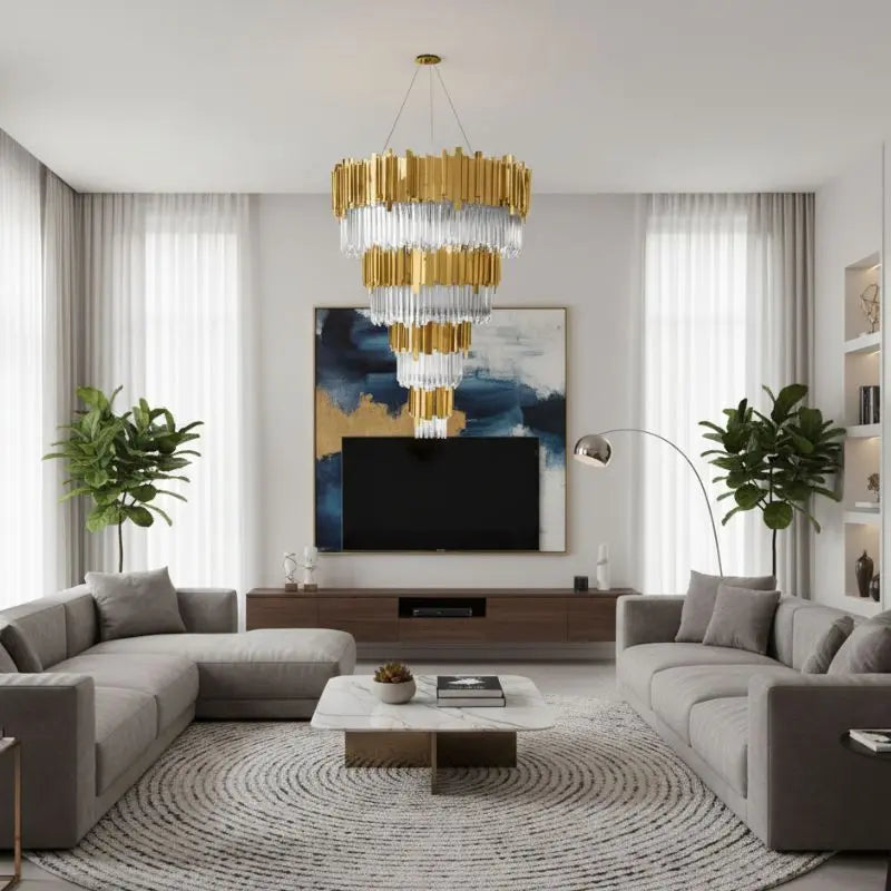
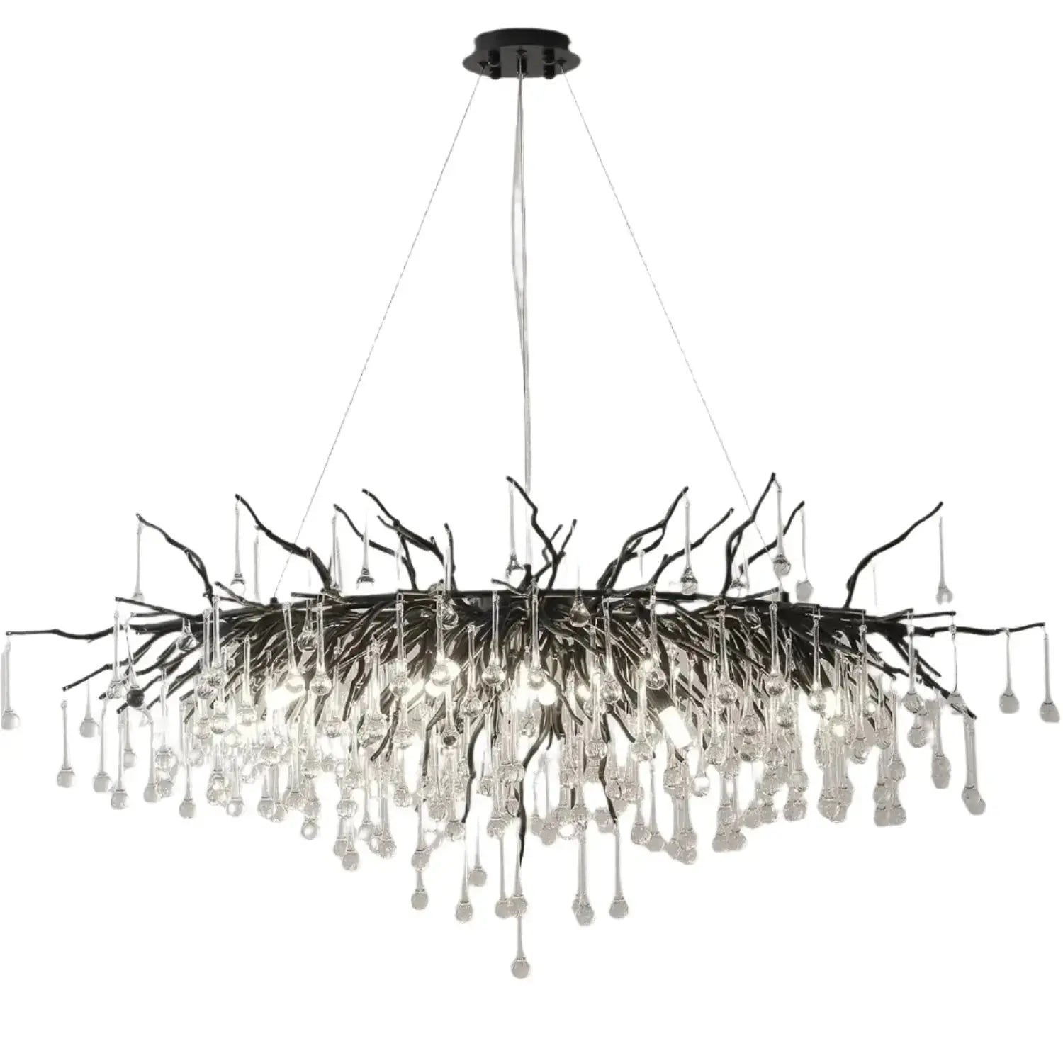
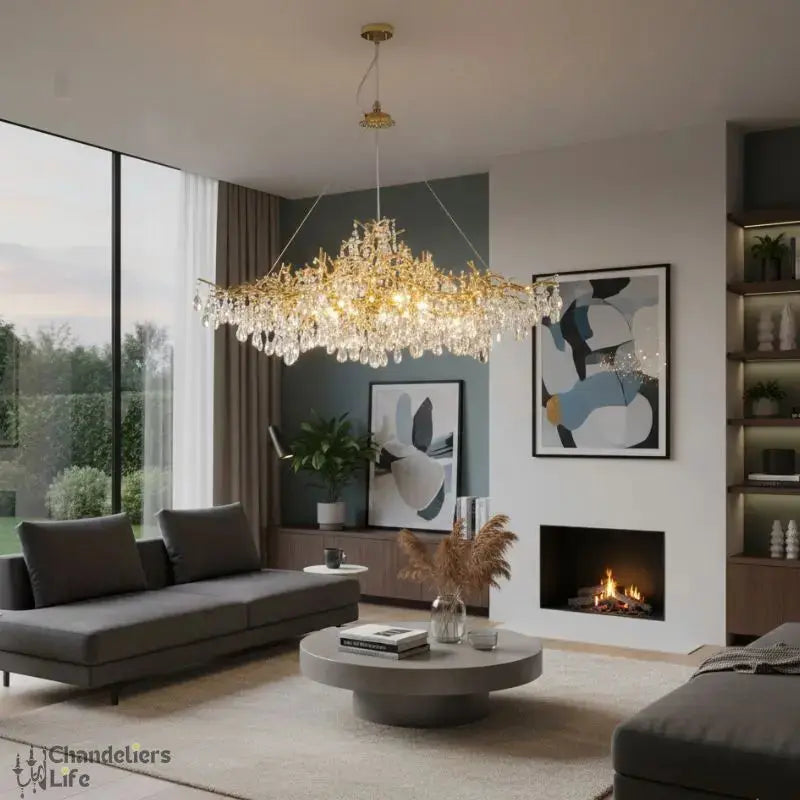
- Use exquisite chandeliers to elevate the elegance of the space while complementing the shade.
A room painted in Tissue Pink feels like a warm embrace—subtle, inviting, and endlessly charming.
6. Gentleman’s Gray
Gentleman’s Gray is a timeless choice for those looking to add a touch of sophistication and depth to their living rooms. This rich, deep gray-blue shade feels both classic and modern, making it a versatile option for a variety of decor styles. Whether your space leans traditional or contemporary, Gentleman’s Gray delivers a bold yet calming presence.
Why Choose Gentleman’s Gray?
- Versatility: Pairs beautifully with neutral furniture, metallic accents, and even warmer tones like caramel or ochre.
- Mood Enhancer: Creates a cozy, intimate atmosphere without making the room feel small.
- Statement Maker: Perfect for accent walls, built-in shelves, or even entire rooms for a dramatic effect.
Design Tips for Gentleman’s Gray
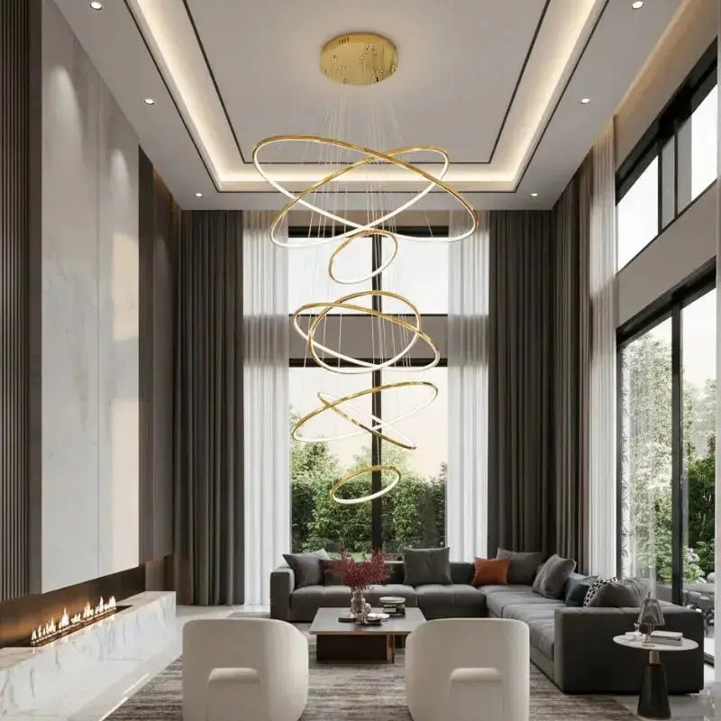
- Pair it with modern lighting options like sleek chandeliers or brass table lamps to highlight its depth.
- Use light-colored furnishings or area rugs to balance the darker tones of the paint.
- Add pops of color—think mustard yellow or coral—for a playful contrast.
Gentleman’s Gray isn’t just a paint color; it’s a mood. Its deep hue invites a sense of calm and sophistication, making it a favorite among interior designers for 2025.
7. Stargazer
Stargazer, a stunning deep blue from Sherwin-Williams, is the kind of color that demands attention. This rich, moody shade is perfect for creating a sense of drama and sophistication in your living room. Whether you use it on all four walls or as an accent, it brings a bold, modern vibe to any space.
Why Choose Stargazer?
- Versatile Pairing: It pairs beautifully with metallic accents like gold or brass, as well as lighter tones like cream or soft gray.
- Statement-Making: Ideal for feature walls, it draws the eye and anchors the room’s design.
- Atmospheric: This color can make a space feel intimate and cozy, especially when paired with warm lighting.
Tips for Using Stargazer
- Balance with Neutrals: To avoid overwhelming the room, balance this dark hue with neutral furniture or décor.
- Layer Textures: Combine velvet cushions, woven throws, and sleek metallics for a luxurious layered look.
- Test the Light: Paint a small section first to see how it interacts with your room’s natural and artificial lighting.
Bold colors like Stargazer can completely transform a space, making it feel both contemporary and timeless. It’s a choice for those who want their living room to stand out while still feeling inviting.
8. Deep Sapphire
Deep Sapphire is a color that commands attention. This bold, rich shade of blue brings a sense of sophistication and depth to any living room. It's the perfect choice for creating a dramatic yet calming space.
Why Choose Deep Sapphire?
- Versatility: Works beautifully with various styles, from modern to traditional.
- Mood Enhancer: Its rich tone adds a serene yet luxurious vibe.
- Pairing Options: Complements metallic accents like gold or brass effortlessly.
Styling Tips:
- Use Deep Sapphire on an accent wall to make a bold statement.
- Pair it with light-colored furniture to balance its intensity.
- Add texture with velvet or silk cushions in similar jewel tones.
A room painted in Deep Sapphire feels like stepping into a serene retreat, offering both comfort and elegance.
9. Mint Julep
Mint Julep is the kind of color that makes a room feel instantly fresh. This soft, minty green has a gentle brightness that works beautifully in living rooms, especially if you’re aiming for a space that feels open and inviting. It’s versatile enough to pair with both modern and traditional decor styles.
Why Choose Mint Julep?
- Creates a calming atmosphere, perfect for relaxation.
- Reflects natural light, making small spaces appear larger.
- Pairs wonderfully with neutral furniture or natural wood tones.
Design Tips with Mint Julep
- Use it as a wall color to bring a subtle pop of color without overwhelming the space.
- Pair with white trim for a crisp, clean look.
- Add accents in gold or brass to elevate the room’s elegance.
Mint Julep is a color that whispers sophistication while still being approachable. It’s like a breath of fresh air for your living room.
10. Pink Diamond
Step into a world of subtle charm with Pink Diamond, a blush pink hue that feels like a soft embrace for your living room walls. This color strikes the perfect balance between playful and sophisticated, making it a versatile choice for a variety of decor styles.
Why Choose Pink Diamond?
- Warm and Inviting: Its gentle pink undertone adds a cozy warmth to any space.
- Versatile Pairing: Works beautifully with neutral tones like beige, gray, and white.
- Modern Elegance: Complements metallic accents such as gold or rose gold for a chic, contemporary look.
Styling Tips
- Pair Pink Diamond walls with crisp white trim for a clean, classic finish.
- Incorporate soft textures like velvet or linen in neutral shades to enhance the cozy vibe.
- Add pops of deeper jewel tones, like emerald or navy, for a dramatic contrast.
Looking for a way to make your living room feel both stylish and serene? Pink Diamond might just be the perfect fit. Its delicate hue creates a soothing atmosphere while still making a statement.
11. Lily Lavender
Lily Lavender is a soft, ethereal shade that brings a touch of elegance to any living room. This delicate hue, reminiscent of blooming lavender fields, is perfect for creating a calm and inviting atmosphere. Its versatility makes it an excellent choice for both modern and traditional spaces.
Why Choose Lily Lavender?
- Tranquility: This pastel shade promotes relaxation, making it ideal for spaces where you unwind.
- Versatility: Pairs beautifully with neutrals like beige or gray, as well as bolder accents like deep plum or navy.
- Timeless Appeal: Soft pastels like Lily Lavender never go out of style, ensuring your living room feels fresh for years to come.
Styling Tips
- Furniture: Opt for white or light wood furniture to keep the room airy and open.
- Textures: Layer with plush throws, velvet cushions, or a soft area rug to add depth and coziness.
- Accents: Incorporate metallics like gold or silver for a touch of sophistication.
A room painted in Lily Lavender feels like a gentle embrace—serene, sophisticated, and effortlessly stylish.
12. Amber Glow
Looking to add warmth and energy to your living room? "Amber Glow" is a stunning choice for 2025, combining the richness of golden yellows with a touch of burnt orange. This vibrant hue creates a cozy and inviting atmosphere while still feeling sophisticated.
Why Choose Amber Glow?
- Warm and Welcoming: Perfect for creating a space where people want to gather.
- Versatile Pairings: Pairs beautifully with natural wood, beige, and even deep blues for contrast.
- On-Trend: Golden ambers are trending in 2025, making your space feel fresh and modern.
How to Use Amber Glow in Your Living Room
- Accent Wall: Highlight one wall to make it the focal point of your room.
- Furniture Accents: Think throw pillows, rugs, or even a bold armchair in this color.
- Layered Lighting: Use warm-toned lights to enhance the glow of the paint.
Pro Tip: When using a bold color like Amber Glow, balance it with neutral tones in your furniture and decor to avoid overwhelming the space.
For more ideas on how to transform your living room, check out creative accent wall ideas that can make your space truly unique.
13. Yolk Yellow
Looking for a color that radiates energy and warmth? Yolk Yellow is your answer. This bold, sunny shade brings a sense of optimism and brightness to any living room, making it perfect for creating an inviting and cheerful space.
Why Choose Yolk Yellow?
- Vibrant and Energetic: This color instantly uplifts the mood of a room, making it a great choice for social spaces.
- Versatile Pairing: Combine it with whites, grays, or even deep blues for a balanced look.
- Natural Light Enhancer: It reflects light beautifully, making smaller or darker rooms feel more open.
Styling Tips for Yolk Yellow
- Accent Walls: Paint a single wall in Yolk Yellow to make it the focal point of your living room.
- Furniture Highlights: Pair a yellow sofa or armchair with neutral-toned rugs and curtains.
- Decor Accents: Add throw pillows, vases, or artwork in Yolk Yellow to tie the room together without overwhelming the space.
Tip: If you’re hesitant to commit to an entire wall, start small with accents or furniture pieces to introduce the color gradually.
Yolk Yellow isn’t just a paint color; it’s a mood setter. Whether you’re hosting a lively gathering or enjoying a quiet afternoon, this shade ensures your living room feels full of life and character.
14. Harvest Gold
Harvest Gold is making a strong comeback in 2025, and it’s easy to see why. This rich, golden hue feels nostalgic yet refreshingly modern. It’s the perfect balance of warmth and sophistication, making it ideal for living rooms that need a cozy yet stylish touch.
Why Choose Harvest Gold?
- Timeless Appeal: Its retro vibe gives a nod to the past while still feeling contemporary.
- Versatile Pairing: Works beautifully with earthy tones like terracotta, olive green, and deep browns.
- Mood Enhancer: This sunny shade can brighten up a room without being overpowering.
Styling Tips for Harvest Gold
- Pair it with neutral furniture to let the color shine without overwhelming the space.
- Add accents like throw pillows or rugs in complementary shades like rust or cream.
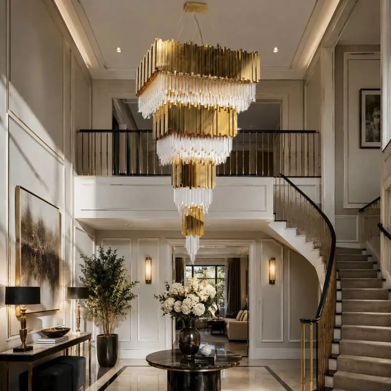
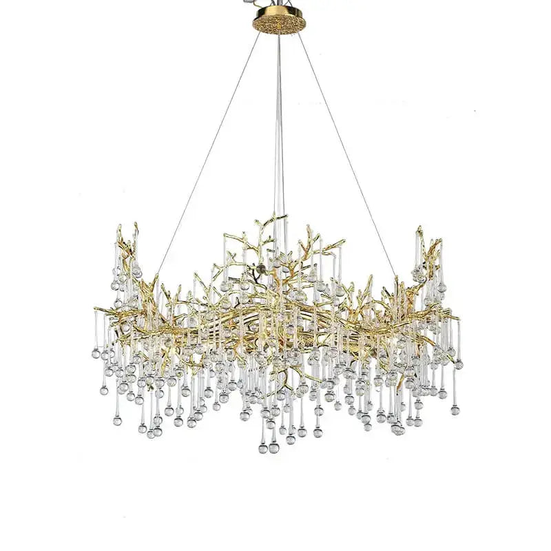
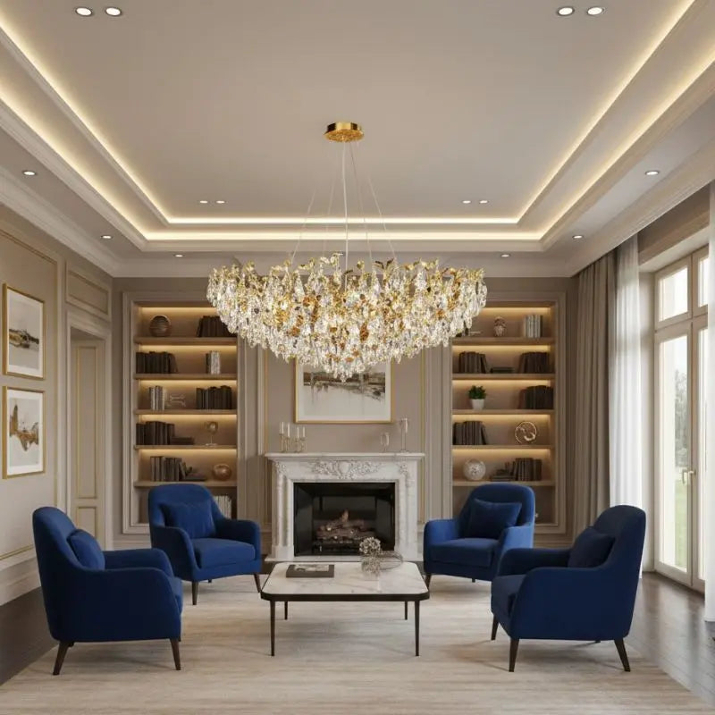
- Consider using elegant lighting options like a chandelier to enhance the golden tones.
"Harvest Gold is more than just a color—it’s an invitation to create a room that feels both vibrant and inviting."
15. Rainwashed
Sherwin Williams' "Rainwashed" is a soft, greenish-blue shade that brings a sense of calm and serenity to any living room. This color's subtle blend of green and blue makes it perfect for creating a tranquil and inviting space. Whether your style leans coastal, minimalist, or modern, "Rainwashed" offers a versatile backdrop that pairs beautifully with a variety of decor styles.
Why Choose Rainwashed?
- Tranquility: Its muted tones promote relaxation, making it ideal for spaces where you unwind.
- Versatility: Works well with neutral furnishings, white trims, or even bold accent pieces.
- Light Enhancement: Reflects natural light beautifully, brightening up rooms without feeling stark.
Pairing Suggestions
- Neutral Accents: Combine with white or light gray furniture for a clean, airy look.
- Natural Elements: Add wooden furniture or woven textures to enhance its earthy feel.
- Bold Pops: Pair with navy or mustard accents for a modern twist.
Pro Tip: Test "Rainwashed" on your walls during different times of the day. Its undertones can shift subtly depending on the lighting, giving you a dynamic and ever-changing ambiance.
For those exploring living room color schemes, "Rainwashed" is a standout choice for creating a peaceful yet stylish retreat.
16. Sage Green

Sage Green is one of those colors that feels like a breath of fresh air for your home. It’s earthy, calming, and oh-so-versatile. Whether your living room is modern, rustic, or somewhere in between, this shade can create a serene and welcoming atmosphere.
Why Choose Sage Green?
- Natural Vibes: Sage green brings the outdoors in. It’s like having a little slice of nature right in your living room.
- Pairs Well with Neutrals: This shade works beautifully with whites, creams, and warm wood tones.
- Timeless Appeal: Unlike trendier colors, sage green has staying power. It won’t feel outdated in a few years.
Styling Tips for Sage Green
- Accent Walls: Use sage green for a single wall to add depth without overwhelming the space.
- Furniture Pairings: Combine sage green walls with natural wood furniture for a cohesive look.
- Decor Accents: Add pops of gold or brass in lighting fixtures or picture frames to elevate the room.
Tip: If you’re unsure about committing to green walls, start small with sage green throw pillows or curtains. It’s a low-risk way to test the color in your space.
For more inspiration, check out living room paint colors that can transform your home into a cozy retreat.
17. Swiss Coffee
Swiss Coffee is a timeless color choice that blends creamy white with just a touch of warmth. This versatile shade by Benjamin Moore is the ultimate neutral for creating a cozy and inviting atmosphere. Whether you’re going for a minimalist look or layering it with other earthy tones, Swiss Coffee adapts beautifully to any style.
Why Swiss Coffee Stands Out:
- Neutral Yet Warm: It’s not stark white, which can sometimes feel too clinical. The subtle warmth gives it a homey vibe.
- Pairs Well With Everything: From beige sofas to wooden floors, Swiss Coffee complements a variety of textures and colors.
- Brightens Small Spaces: Perfect for rooms with limited natural light, it reflects light to make spaces feel bigger and brighter.
Styling Tips:
- Pair Swiss Coffee walls with natural wood furniture for a Scandinavian-inspired look.
- Use it as a backdrop for colorful artwork or bold accent pieces.
- Add layers of texture with throw blankets, rugs, and pillows in tan or gray to enhance its cozy feel.
Looking for a color that works in every room? Swiss Coffee might just be your new go-to. Its creamy tone creates a welcoming environment without overwhelming the space.
18. Light Gray
Light gray is one of those colors that just works. It’s subtle, it’s modern, and it can elevate your living room without overpowering the space. This shade is perfect for people who want a clean, minimalist look but still crave a little warmth.
Why Light Gray Works
- Neutral and Versatile: Light gray pairs well with almost any color palette, whether you’re going for bold accents or muted tones.
- Enhances Natural Light: This shade reflects light beautifully, making your room feel airy and spacious.
- Timeless Appeal: It’s a classic choice that won’t go out of style anytime soon.
Styling Tips for Light Gray Walls
- Add texture with soft furnishings like velvet pillows or a chunky knit throw.
- Use metallic accents like brass or chrome for a touch of sophistication.
- Incorporate pops of color through artwork, rugs, or decorative pieces to keep the room lively.
Popular Light Gray Paints
| Brand | Shade Name | Description |
|---|---|---|
| Sherwin Williams | Repose Gray | A soft, warm gray with subtle beige undertones. |
| Benjamin Moore | Classic Gray | A light, neutral gray that complements any decor. |
| Lowe's Valspar | Gravity | A cool gray that adds depth without being too dark. |
Light gray is the ultimate backdrop for creativity. It’s understated enough to let your furniture and decor shine, yet stylish enough to make a statement on its own.
19. Mocha Mousse

Mocha Mousse, a rich and creamy brown, is one of the standout shades of 2025. This color brings a sense of warmth and stability to any living room, making it perfect for creating a cozy, inviting atmosphere. Its versatility lies in its ability to pair beautifully with both neutral and bold accent colors.
Ways to Incorporate Mocha Mousse
- Accent Walls: Transform your living space by painting a single wall in Mocha Mousse. It creates a focal point without overwhelming the room.
- Furniture and Decor: Choose plush ottomans, textured armchairs, or quilted throws in this color to add depth and comfort.
- Layering with Neutrals: Combine Mocha Mousse walls with lighter tones like cream or beige for a balanced, harmonious look.
Why Choose Mocha Mousse?
This shade is not just about aesthetics—it’s also about creating a mood. Mocha Mousse evokes feelings of groundedness and calm, making it ideal for spaces where you relax or entertain. Plus, it’s incredibly adaptable, fitting seamlessly into both modern and traditional interiors.
When paired with natural wood finishes or metallic accents, Mocha Mousse can elevate your living room into a stylish yet serene retreat.
For more inspiration on transforming your living room, explore creative accent wall ideas to enhance your space with Mocha Mousse and other complementary shades.
20. Cinnamon Slate
Cinnamon Slate is a dusky brown-red color that strikes a perfect balance between earthy sophistication and modern flair. This shade brings warmth and depth to any living room, making it both inviting and stylish. Whether you're aiming for a cozy retreat or a bold statement, Cinnamon Slate adapts beautifully.
How to Incorporate Cinnamon Slate in Your Living Room
- Accent Walls: Use Cinnamon Slate on a single wall to create a focal point without overwhelming the space.
- Furniture Pairing: Pair this color with neutral-toned furniture, like beige or cream, for a balanced look.
- Lighting Tips: Enhance its richness with warm lighting. Layering lighting with overhead fixtures, floor lamps, and table lamps works wonders for this shade.
For a truly harmonious living room, combine Cinnamon Slate with natural wood accents or metallic touches like brass or copper. These elements add texture and highlight the color’s versatility.
Why Choose Cinnamon Slate?
- It bridges the gap between traditional and contemporary design.
- Works well with both bold jewel tones and soft pastels.
- Adds a touch of elegance without being overpowering.
If you’re looking to transform your living room into a space that feels both grounded and chic, Cinnamon Slate is a standout choice.
21. Leather Saddle Brown
Leather Saddle Brown is the kind of color that instantly brings warmth and richness to any living room. It’s like wrapping your space in a cozy, timeless hug. This shade is a deep, earthy brown that pairs beautifully with natural materials and textures. Whether you’re going for a rustic vibe or modern elegance, this color fits right in.
Why Choose Leather Saddle Brown?
- It creates a grounded and stable atmosphere, perfect for living rooms where you want to relax and unwind.
- This shade complements both warm and cool tones, making it versatile for various decor styles.
- Works well with natural wood furniture, leather accents, and even bold pops of color like mustard yellow or teal.
Tips for Decorating with Leather Saddle Brown
- Layer textures: Pair this color with soft throws, woven rugs, and plush cushions to add depth and coziness.
- Accent with metallics: Add brass or gold fixtures for a touch of sophistication.
- Mix in greenery: Houseplants like ferns or snake plants pop beautifully against this earthy hue.
Pro Tip: Use Leather Saddle Brown on an accent wall or as the main color for a statement piece like a sofa or armchair. It’s bold yet inviting, striking the perfect balance for a stylish living room.
22. Chowning’s Tan
If you're on the hunt for a paint color that’s both timeless and versatile, Chowning’s Tan might just be your new favorite. This warm neutral by Benjamin Moore offers a perfect balance between beige and taupe, making it a go-to choice for creating cozy yet sophisticated living spaces.
Why Choose Chowning’s Tan?
- Versatility: It pairs beautifully with a variety of accent colors, from earthy greens to crisp whites.
- Warmth: The subtle undertones bring a sense of comfort and groundedness to any room.
- Timeless Appeal: This shade won’t go out of style, making it a safe bet for long-term use.
How to Use Chowning’s Tan in Your Living Room
- Walls: Paint all four walls for a cohesive, warm ambiance.
- Accent Walls: Combine it with darker tones like "Leather Saddle Brown" for added depth.
- Trim and Moldings: Use Chowning’s Tan for a modern twist on traditional white trim.
A room painted in Chowning’s Tan feels like a warm embrace—subtle, inviting, and endlessly adaptable.
For those looking to transform your living room with creative wall decor ideas, Chowning’s Tan provides the perfect backdrop. Its neutral tone enhances statement pieces like oversized mirrors or gallery walls while maintaining a calm and harmonious atmosphere.
23. Rain Cloud
Rain Cloud is a muted blue that feels like a breath of fresh air. This versatile shade is perfect for creating a calm and serene atmosphere in your living room. It’s soft enough to act as a neutral, yet it carries enough personality to stand out. Whether you’re aiming for a coastal vibe or a modern minimalist look, Rain Cloud can be your go-to.
Why Choose Rain Cloud?
- It pairs beautifully with natural wood tones, enhancing a cozy and organic feel.
- Works well with whites and light grays for a clean, airy aesthetic.
- Complements bold accents like mustard yellow or deep teal for a pop of contrast.
Tips for Using Rain Cloud in Your Living Room:
- Paint all four walls to immerse the room in its soothing tone.
- Use it as an accent wall behind a sofa or entertainment center.
- Incorporate it into furniture or decor, like a painted coffee table or throw pillows.
A living room painted in Rain Cloud can transform into a peaceful sanctuary, perfect for unwinding after a long day. Its understated elegance makes it a timeless choice for any home.
24. Chartreuse
Chartreuse is a bold and vibrant color that sits perfectly between green and yellow, creating a lively and energetic vibe for any living room. This shade is ideal for those who want to make a statement while keeping the space fresh and inviting.
Why Choose Chartreuse?
- Dynamic Energy: Chartreuse brings a burst of energy to your living room, making it feel alive and welcoming.
- Versatility: It pairs beautifully with neutral tones like gray or beige, as well as deeper shades like navy or charcoal.
- Nature-Inspired: The green undertones evoke a sense of connection to the outdoors, perfect for creating a harmonious and balanced interior.
Tips for Using Chartreuse in Your Living Room
- Accent Walls: Use chartreuse on a single wall to create a focal point without overwhelming the space.
- Furniture and Decor: Incorporate chartreuse through statement furniture pieces, throw pillows, or rugs.
- Layer with Neutrals: Balance the vibrancy of chartreuse with softer, neutral colors to maintain a cohesive look.
Looking to refresh your home? Chartreuse might just be the bold yet balanced choice you need to transform your space into a lively haven.
25. Mauve Finery and more
Mauve Finery is one of those colors that just feels timeless. It’s soft, a little mysterious, and can add a sense of subtle elegance to your living room. This shade works beautifully as a base color or even as an accent wall to break up neutrals. For 2025, mauve tones are making a comeback in a big way, blending perfectly with both modern and vintage-inspired decor.
Why Choose Mauve Finery?
- Versatile Pairing: Mauve complements a variety of colors, from deep jewel tones like emerald green and navy blue to lighter shades like blush or cream.
- Mood Enhancer: It creates a cozy yet sophisticated vibe—perfect for spaces where you want to relax or entertain.
- Works in Any Light: Whether your living room gets tons of natural sunlight or relies on artificial lighting, this shade adapts beautifully.
Styling Tips for Mauve Finery
- Pair it with brass or gold accents for a touch of luxury.
- Incorporate textured fabrics like velvet or linen to add depth to the space.
- Use it as a backdrop for bold, contrasting furniture pieces, such as a mustard yellow sofa or a dark wooden coffee table.
Mauve Finery is more than just a paint color—it’s a statement of understated elegance that adapts to your style, whether bold or minimalist.
Conclusion
Choosing the right paint color for your living room in 2025 is all about creating a space that feels like home. Whether you’re drawn to calming greens, bold jewel tones, or soft pastels, the key is to pick a shade that reflects your personality and fits your lifestyle. Don’t rush—test colors in different lighting, consider your furniture and decor, and trust your instincts. At the end of the day, your living room should be a place where you can relax, entertain, and feel completely at ease. So grab some swatches, take your time, and have fun transforming your space!
Frequently Asked Questions
What are some calming paint colors for living rooms in 2025?
For a calming vibe, consider shades like 'Sea Salt' by Benjamin Moore, 'Rainwashed' by Sherwin Williams, or 'Sage Green.' These colors are soothing and bring a touch of nature indoors.
Which paint colors work well with modern decor?
Modern spaces often pair well with versatile neutrals like 'Swiss Coffee' by Benjamin Moore, 'Light Gray,' or bold jewel tones like 'Gentleman’s Gray' by Benjamin Moore.
How can I test paint colors before committing?
You can test colors by applying small swatches on your wall and observing them under different lighting conditions throughout the day. Apps like Sherwin Williams’ ColorSnap can also help you visualize colors in your space.
What are the trending pastel paint colors for 2025?
Trending pastels include 'Tissue Pink' by Benjamin Moore, 'Mint Julep' by Pantone, and 'Pink Diamond' by Valspar. These shades add a soft, playful touch to any room.
Are there any eco-friendly paint options for 2025?
Yes, many brands now offer low-VOC and eco-friendly paints. Look for labels like 'Greenguard Certified' to ensure your paint choice is safe for you and the environment.
What finish should I choose for living room walls?
Eggshell is a popular choice for living rooms because it offers a slight sheen, is easy to clean, and works well in most spaces.